A great user experience is the result of a strong employee, stakeholder
and partner experience. In the design consulting space I have led the end-to-end design and
project lifecycle while also doing the work of a UX designer.
How can I add value to your
dream team?
As a consultant
Creating proposals
Scoping the project — inclusions, exclusions, limitations
Creating a project roadmap
Estimating timelines
Being the point of contact and building rapport with the client
As a UX designer
Conducting heuristic analysis
Planning and conducting user research
Creating concepts and optimising user flows
Defining information architecture
Creating high-fidelity wireframes
Reviewing UI
Project snapshot
Omnichannel approach
to after sales customer experience
Product
TATA AIG is a platform where users purchase personalised insurance
policies with ease.
India's first fast-growing general insurance company, a joint venture
between the TATA Group and American International Group.
Role
Led end-to-end research and UX for the project, as a spoke from the
consultancy side — from gathering requirements through to owning the delivery,
working closely with stakeholders at TATA AIG.
Key deliverables
Self-service journey
Insurance agent workflow
Website
App
Service design
KPIs
Minimise user attrition and optimise retention rates
Reduce time and optimise the user journey
Increase NPS
Decrease inbound customer care calls
Revitalise the website with a contemporary, refreshed design
Appreciations
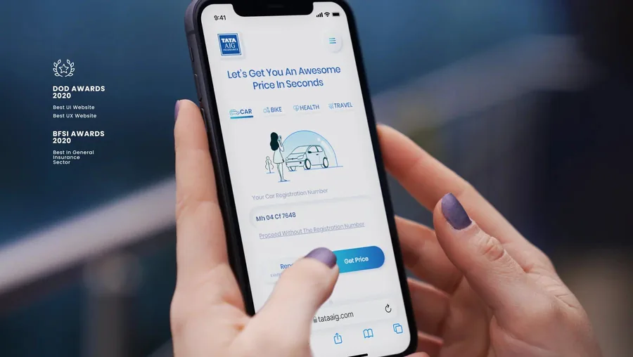
Won DOD Awards 2020 for Best UX Website and Best UI Website
BFSI Awards 2020 for Best in the general insurance sector
The problem
Increase the retention ratio across lines of business — health, motor and travel.
Understanding what was actually happening
Synthesising customer tickets
Before solving the problem, identifying it is the work — and the complaints
already in the system are the proof. I synthesised customer complaints and
categorised them into the problem areas responsible for drop-off and
dissatisfaction.
Problem areas: functionality,
customer experience, technical issues, product and pricing, human errors,
and miscellaneous.
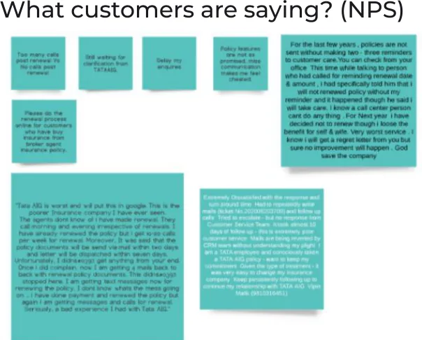
Verbatim NPS responses clustered by theme. The long notes are the
useful ones — unprompted accounts of renewal reminders arriving late, or not
at all.
Identifying every customer touch-point
As one of the pioneers in the industry, the company had developed sales
channels over many years. Each one is a place a policyholder can arrive,
get stuck, or leave — and each was owned by a different part of the business.
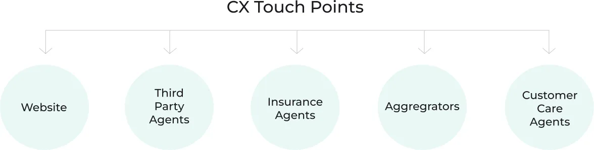
Five routes in, one customer. Note that three of the five are
human intermediaries — which is why the agent workflow became a deliverable
in its own right.
Mapping the policy life cycle and customer journeys
Mapping the key decision points and pain points across the journeys is what
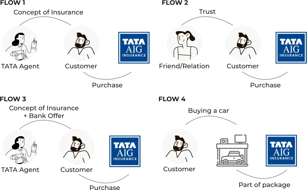
surfaces where an intervention is worth making. Four distinct routes to purchase
emerged, each starting from a different trigger — an agent, a friend, a bank
offer, or buying a car.
Four ways a policy gets bought. Only one of them starts with the
customer choosing the insurer — which reframes what "retention" even means.The lifecycle split into one-time and recurring events. Everything
after "purchase" is after-sales — and that is where the attrition sits.
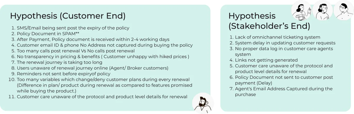
Hypotheses, written down first
As the foundation for the investigation we started with a handful of
calculated guesses, split between what we believed was happening for the
customer and what was happening inside the business. Writing them down first
is what makes the research capable of proving us wrong.
Eleven customer-side guesses and seven stakeholder-side. The
stakeholder list is the interesting half — it names internal causes like
system delay and policy documents never reaching the customer.
On-the-ground research
Insurance is a complex, intertwined ecosystem of internal processes, norms,
agents, customer care executives and customers. Every perspective had to be
considered, and several had to be cross-verified against each other to validate
the hypotheses.
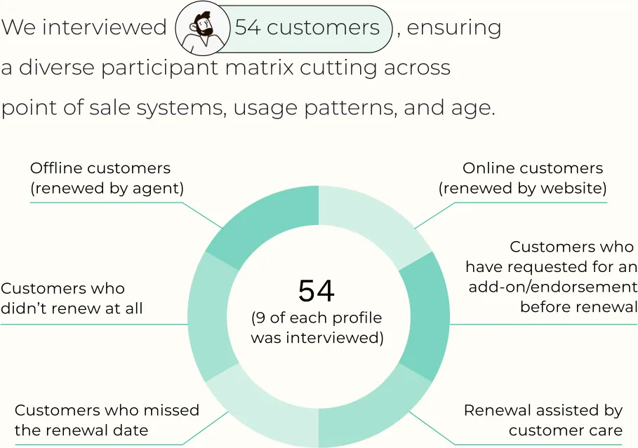
54customers interviewed, 9 of each profile
9insurance agents
9customer care executives
9competitors analysed
The participant matrix deliberately cut across point-of-sale system,
usage pattern and age. The six segments are renewal behaviours — including the
two that matter most: customers who missed the renewal date, and customers who
did not renew at all.
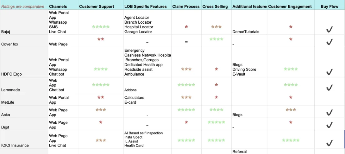
Competitor analysis
An assessment of the strengths and weaknesses of current and potential
competitors, giving both offensive and defensive context for where the
opportunities were.
Nine insurers compared across channel coverage, claim process and
cross-sell. The right-hand column — whether a clean buy flow exists at all —
is the one that separated the digital-native insurers from the incumbents.
Areas of intervention
Where the research said the retention problem actually lived.
Neglected after-sales service
After buying a policy, customers rely primarily on customer care or agents for
service requests. That process is often frustrating — long wait times, little
self-service, inconsistent resolutions.
Customer poaching by competitors
Emerging insurers differentiate on seamless onboarding and superior customer
experience, attracting policyholders away from traditional players. Competitor
agents lure customers with aggressive pricing and better service offerings.
Inefficient policy renewals
Renewal reminders are either delayed or fail to reach certain customer segments.
Broken or non-functional renewal links lead to drop-offs, causing inconvenience
and policy lapses.
Lack of persuasion
Customer care agents lack access to detailed product information such as No Claim
Bonus benefits, cross-selling options and bundling. Opportunities for upsell and
retention are missed.
Designing the solution
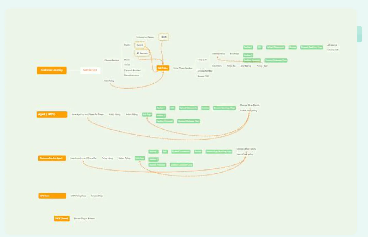
Concepts and user flows
Three concept directions were explored in parallel — a conversational design,
a tile-based design, and a policy-swipe design — before the flows were mapped
end to end across customer, agent and customer-care paths.
The full service flow. Orange nodes are entry points, green are
actions — the density on the right is the self-service surface that did not
exist before.
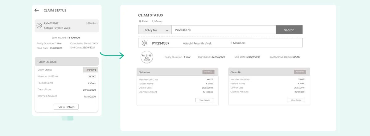
Mobile-first, then adapted up
Screens were designed following a mobile-first philosophy and then adapted for
desktop. I identified the components and interactions that needed an adaptive
approach, rather than a straight scale-up, to work properly on both.
Claim status, mobile beside desktop. The stacked claim card becomes
a side-by-side comparison on desktop rather than simply widening.
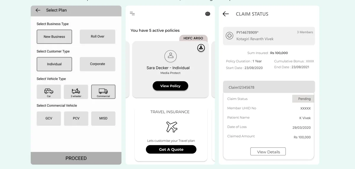
Forms as wizards, not walls
Physical forms were transformed into wizard-based interfaces using sequential
progressive disclosure, so only the information relevant to the user's previous
choices is ever on screen.
Visuals were used wherever possible to support recognition over recall, letting
agents generate quotes quickly with less cognitive load.
Vehicle type and business type as icon choices rather than dropdowns —
recognition over recall, which is what makes an agent fast.
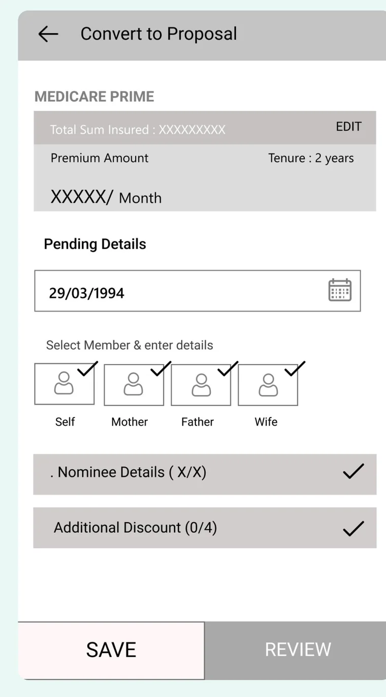
Letting people fill forms out of order
I created an interstitial landing page for each form, letting users complete
sections in any order rather than being held to a predefined sequence. It gives
situational awareness of progress — how much is done, and which parts remain.
Each section carries its own completion tick and a running count.
The form stops being a queue and becomes a checklist.
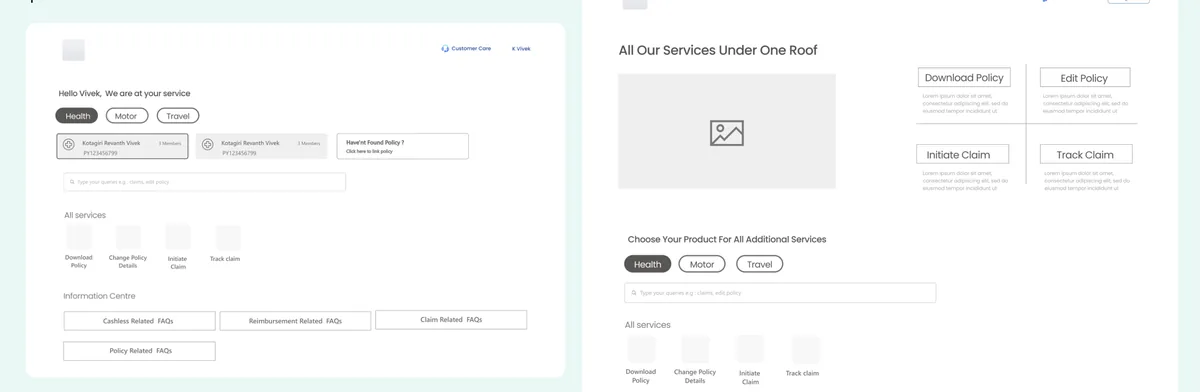
One roof for everything after the sale
A unified landing page surfaces the frequently performed actions across lines
of business, so customers managing several policies get one consistent place to
act. The structure is deliberately extensible to future lines of business.
Download policy, edit policy, initiate claim, track claim — the four
after-sales actions that previously meant a phone call, promoted to the front door.
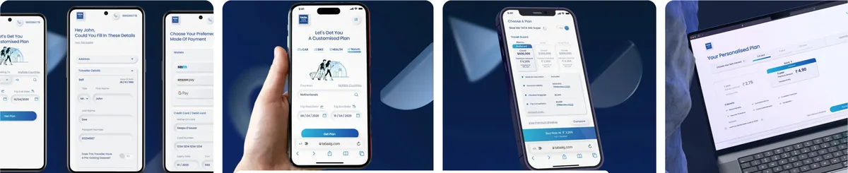
The shipped experience across mobile and desktop.
Recognition
DOD Awards 2020Best UX Website and Best UI Website
BFSI Awards 2020Best in the general insurance sector
What customers said
Reviews left on the shipped app.
★★★★☆
“Seems awesome interface, easy to use and add policy but taking time in
digitizing the policy”
Manish Sharma · 16/07/2021
★★★★★
“Claims process is smooth and easy. User friendly interface”
Satya Prakash Gupta · 25/06/2021
★★★★★
“Good quality app, lives up to the brand. The app is smooth to operate.”
Vikash Kumar · 05/05/2021
Similar work
Other engagements where I did the same kind of thing.
Mercedes-Benz
Part of building a sales-assist platform for retail sales representatives, adhering
to a global-first vision. Increased cohesion across the product by streamlining all
modules in line with the design system, and introduced new components to improve
usability.
HDFC Life
Redesigned the end-to-end claim process for group insurance policies to bring down
turnaround time, with a personalised experience for key account manager, master
policy holder, nominee and insured. Designed bulk actions, a quick-search widget
and OCR flows.
Angel Broking
Reimagined the partner experience for an audience that was predominantly
unorganised and offline. Built a tailor-made mobile-first experience for equity
sub-brokers, mutual fund sub-brokers and digital referral agents, introducing
tasks, reports, pinboard, call recorder and call-to-text.
C-Zentrix
Redesigned the virtual workspace for call centre agents, working closely with them
in their own context and environment to understand their pain points. Optimised
workflows, improved usability, and introduced a voice UI that enabled seamless
multitasking.
The original presentation holds the full process archive — every mural, workshop
artefact and wireframe at full size.
 Revanth Vivek Kotagiri